Advanced Spreadsheets
Lesson 6 – Advanced Charts and Visualisation
This lesson focuses on creating and formatting charts so that data is communicated clearly and professionally. You will learn how to choose appropriate chart types, format key elements, use advanced chart features such as combined charts and sparklines, and link charts to dynamic data.

1. Creating charts from data
Charts are created from data in a worksheet. Good chart design starts with a clean, well-structured data range.
- Select appropriate data ranges, including headings for categories and values.
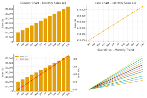
- Create common chart types such as column, bar, line and pie charts using the Insert → Charts options.
- Move a chart between the current worksheet and its own separate chart sheet when you need more space for the chart.
- Change the chart type if the original choice does not communicate the information clearly (for example, change a column chart to a line chart).

2. Choosing the right chart type
Different chart types are suited to different messages. Selecting the right chart helps your audience understand the data quickly.
- Column and bar charts – compare values across categories (for example, sales by region).
- Line charts – show trends over time (for example, monthly sales through the year).
- Pie charts – show proportions of a whole (for example, market share percentages).
- Combined charts – show two related series with different visual styles in one chart (for example, column for sales amount and line for number of units).
- Understand the difference between clustered charts (side-by-side bars/columns for comparison) and stacked charts (parts of a whole within each category).

3. Formatting chart elements
Formatting chart elements improves clarity and makes charts easier to read.
- Edit chart titles so they clearly describe what the chart shows (for example, Monthly Online Sales – 2025).
- Add and format axis titles to explain the meaning of category and value axes (for example, Month, Sales (£)).
- Show, reposition and format legends so that series are easy to identify.
- Adjust axis scales (minimum, maximum and major units) to present the data clearly without distortion.
- Change the display units on the value axis (for example, display values in thousands or millions) to make large numbers easier to read.
- Format data series, including line style, marker style and column/bar width, to highlight important series.
- Add and format data labels to show values on the chart where appropriate.
- Format columns, bars, pie slices, plot area or chart area to display an image (for example, a company logo or a themed background) where this adds value.

4. Advanced chart features
Advanced features help you show trends, highlight key points and display data with different scales.
- Create combined charts, such as column and line, or column and area, to show different series in a single visual.
- Add a secondary axis for data series with very different scales (for example, sales amount vs number of units) so that both series can be read clearly.
- Add trendlines (for example, linear trendline) to show the overall direction of data over time.
- Add or remove data series from a chart when the underlying source data changes.
- Change the chart type for a specific data series (for example, main series as columns and comparison series as a line on the same chart).
- Change chart layout and style quickly using built-in chart layout and style options.
- Emphasise key data points with special formatting (for example, different colour for a target value or the current month).

5. Sparklines – mini charts in cells
Sparklines are small charts displayed inside a single cell. They are useful for showing trends at a very compact scale alongside the data.
- Insert sparklines (for example, line or column sparklines) to show patterns of change for each row of data.
- Place sparklines next to the related data so that the trend can be seen at a glance.
- Format sparklines (for example, show markers for high and low points) to highlight important changes.
- Clear or edit sparklines when the underlying data or analysis needs change.

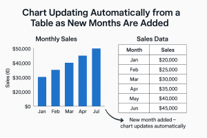
6. Linking charts to dynamic data
Charts linked to tables or well-defined ranges will update automatically as the data changes.
- Base charts on tables or structured data ranges so that new rows and columns are included automatically.
- Observe how charts update when underlying values change, helping to keep reports current.
- Extend the data range and update chart sources when adding new time periods or categories.
- Refresh charts after changing the source data or adding new series.
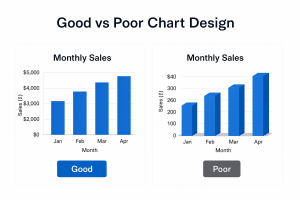
7. Good design principles
Well-designed charts are clear, focused and easy to interpret.
- Keep charts simple and uncluttered – remove unnecessary gridlines and decorations.
- Avoid unnecessary 3D effects that can distort perception of values.
- Use clear labels, legends and titles so the viewer does not need to refer back to the data table.
- Use colours consistently across multiple charts (for example, always use the same colour for a particular region or product).
- Ensure sufficient contrast for readability when charts are printed or projected.
- Check that the chosen chart type and formatting support the key message of the data.
8. Practical Activity
Complete this activity to apply the lesson skills.
- Create a column chart from a monthly sales table, including month names and sales values.
- Add axis titles (for example, Month and Sales (£)) and a meaningful chart title (for example, Monthly Sales – Current Year).
- Add data labels to show exact values and adjust the axis scale and display units (for example, thousands) if necessary to improve readability.
- Create a line chart from the same data to highlight the trend over time and compare it with the column chart.
- Create a combined column and line chart showing sales (£) as columns and number of units as a line on a secondary axis.
- Insert a row of line sparklines next to each product or region to show the sales trend in miniature.
- Experiment with chart styles and layouts to improve clarity, and remove any elements that do not add useful information.