
Advanced Module – Presentations
Lesson 6 – Working With Charts, Tables and SmartArt
This lesson explains how to insert and format charts, tables and SmartArt graphics in presentations. These tools help present information visually and professionally and align with ICDL requirements for charts and diagrams.
1. Adding charts
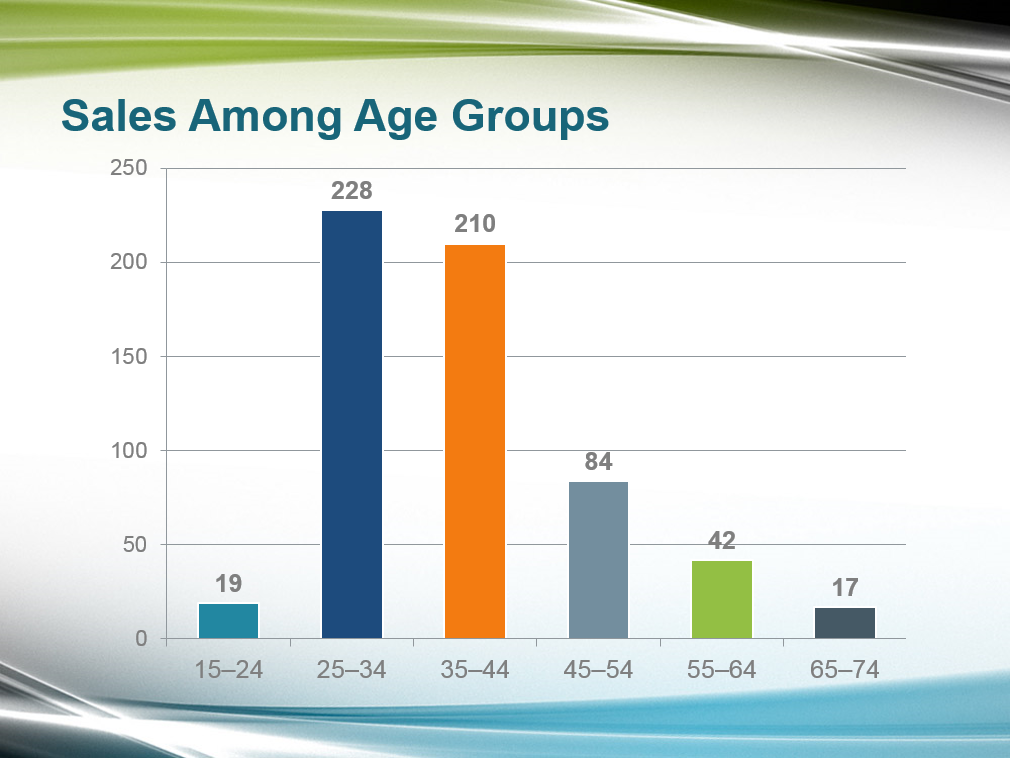
Charts display data visually and are ideal for comparisons, patterns and trends.
- Select Insert > Chart.
- Choose a chart type: Column, Line, Pie, Bar, Area, etc.
- Edit data in the linked spreadsheet window.
- Switch chart types easily using Change Chart Type.
Common chart types:
- Column charts – compare values across categories.
- Line charts – show changes over time.
- Pie charts – percentage proportions.
- Bar charts – long category labels or large data sets.
2. Formatting charts
Use Chart Tools to improve clarity and highlight meaning.
- Edit chart title, axis titles and legend.
- Change colours or apply chart styles.
- Add and customise data labels.
- Show or hide legends and gridlines.
- Adjust gap width and series overlap (ICDL requirement).
Advanced options:
- Format axes: set minimum, maximum and major units.
- Format chart area and plot area with fills or images.
- Change chart type for a specific data series.
3. Adding tables
Tables organise information clearly and make comparisons easier.
- Go to Insert > Table.
- Choose the number of rows and columns.
- Add or remove rows/columns as needed.
- Merge or split cells for improved layout.
Formatting tables:
- Apply table styles or shading.
- Add or remove borders.
- Align text horizontally and vertically.
- Adjust column width and row height for readability.
4. Converting text to a table
- Type text separated by tabs.
- Select the text → Insert > Table > Convert Text to Table.
- Choose layout options for columns and rows.
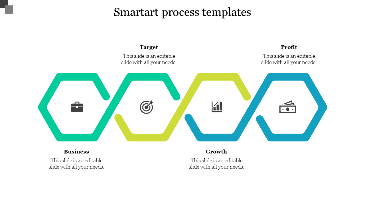
5. SmartArt graphics
SmartArt provides ready-made diagrams for processes, lists and hierarchies.
- Select Insert > SmartArt.
- Choose a category: List, Process, Cycle, Hierarchy, Relationship, Matrix, Pyramid.
- Enter text using the Text Pane.
6. Formatting SmartArt
- Change colours and styles using SmartArt Styles.
- Apply 3D, bevel or shadow effects (use sparingly).
- Reorder shapes or restructure diagrams.
- Add or remove steps to match your content.
- Use Layout options to rearrange diagram flow.
7. Converting between SmartArt and text
- Right-click → Convert to Text to revert to a list.
- Right-click → Convert to Shapes to gain full shape editing control.
8. Inserting charts from Excel
You can insert linked or embedded charts from Excel.
- Copy a chart from Excel.
- Paste into PowerPoint as one of the following:
- Embedded chart – the data is stored inside the presentation.
- Linked chart – updates automatically when Excel data changes (ICDL requirement: linking).
- Break or update links using File > Info > Edit Links to Files.
9. Best practices for visual data
- Use one key message per chart.
- Avoid overcrowded tables—simplify data where possible.
- Use SmartArt only when it adds clarity, not decoration.
- Use high-contrast colours for accessibility.
- Maintain consistent formatting across charts and tables.
10. Practical Activity
- Insert a table showing quarterly sales.
- Convert the table into a chart.
- Insert a SmartArt process diagram with four steps.
- Format the diagram using SmartArt Styles.
- Copy a chart from Excel and paste it as a linked object.
- Change the axis scale or chart type for one data series.